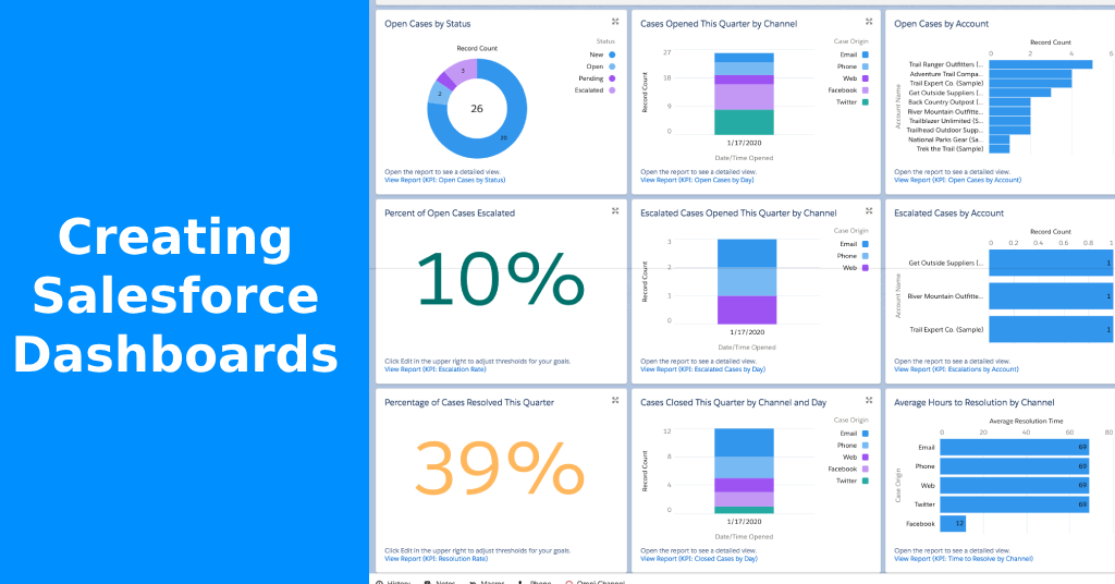
Create actionable dashboards in Salesforce! Dashboards are everywhere. But let’s be honest — most of them collect digital dust.
The real challenge isn’t building dashboards. It’s building ones that actually drive action.
In this guide, you’ll learn how to create actionable dashboards in Salesforce — dashboards that make people stop, decide, and do something.
Why Most Dashboards Fail
- 📉 Too much data, not enough direction
- ❌ Metrics that aren’t tied to decisions
- 😵 Overcomplicated charts
- 🛑 No clear owner or accountability
- 💤 Users stop looking after week one
Dashboards should work like a cockpit. If it’s not helping your team steer or react — it’s just noise.
✅ Step-by-Step: How to Create a Dashboard That Drives Action
🔹 Step 1: Define a Single Objective
Ask: What decision should this dashboard help someone make?
Examples:
- Prioritize accounts?
- Spot at-risk deals?
- Improve case resolution time?
Without a defined purpose, your dashboard is just decoration.
🔹 Step 2: Choose Metrics That Signal Change
Focus on:
- Delta metrics (e.g. “Cases Opened vs Closed”)
- Ratios (e.g. “Lead to Opportunity %”)
- Thresholds (e.g. “Open Opportunities > $50k closing this month”)
Avoid vanity metrics like “Total Records” or “All-Time Revenue.”
🔹 Step 3: Use Salesforce Report Buckets Wisely
Create custom groupings in reports that bucket data (e.g. Aged Cases: 0–7 Days, 8–14 Days, 15+ Days).
👉 Learn how in Salesforce’s Bucket Fields Guide
🔹 Step 4: Build Summary-Level Reports First
Use “summary” and “matrix” formats so your dashboard is lean and interactive.
Then, turn those reports into widgets that are:
- Minimal
- Meaningful
- Drillable
🔹 Step 5: Design With Context
Use:
- Dynamic dashboard filters (e.g. Region, Product)
- Color-coded thresholds (red = alert, green = goal)
- Lightning Dashboard Builder for responsive layouts
Your dashboard is not art — it’s a decision-making tool.
🔹 Step 6: Assign an Owner
Every dashboard should have:
- A data owner (responsible for accuracy)
- A stakeholder (the one who acts on the data)
Without this, nobody will feel responsible for using the data — and it dies.
🔹 Step 7: Review It Every Month
Add dashboard reviews to recurring ops or leadership meetings.
Ask: “Did this dashboard help us act on something last month?”
If not, archive or redesign it.
✅ Best Practices to Create Actionable Dashboards in Salesforce
Building a dashboard is easy. Building one people actually use? That takes strategy. Follow these best practices to ensure your dashboards drive results — not just clicks. Remember we want to use dashboard metrics that actually drive action.
🔹 1. Start with the Question, Not the Chart
Before dragging any widgets, ask:
What question are we trying to answer?
Build backwards from the decision, not forwards from the data.
🔹 2. One Dashboard, One Audience
Avoid trying to please everyone. Sales leaders don’t need to see support metrics. Build focused dashboards with a single owner and audience in mind.
🔹 3. Use Color With Purpose
Red = alert. Green = goal. Yellow = caution.
Don’t use color just to “decorate.” Use it to direct focus.
🔹 4. Keep It to 6–8 Components Max
If you need a scroll bar, it’s too much.
A good rule: if you can’t interpret it in 60 seconds, it’s not actionable.
🔹 5. Audit Usage Monthly
Use a report on reports to track whether your dashboards are viewed. If they’re not used — revise, replace, or retire.
🔹 6. Avoid “All-Time” Metrics
“All-time revenue” or “total leads” doesn’t help people act. Show trends over time, pipeline deltas, or at-risk segments.
🔹 7. Add Context — Not Just Data
Use dashboard filters, custom headers, and field descriptions to give users just enough context to know what they’re looking at — and what to do with it.
Dashboards should move teams forward. Follow these best practices to create actionable dashboards in Salesforce that don’t just inform — they inspire action.
🧠 Useful Dashboard Metrics That Actually Drive Action
- Opportunity Push Count
- Cases Reopened by Agent
- Tasks Not Touched in 7 Days
- Campaigns with Cost > Return
- Lead Conversion Rate by Source
👉 You can track these inside your Salesforce Report on Reports — see how teams are (or aren’t) using the dashboards you’ve built.
🏁 Useful Salesforce Dashboard Final Thoughts
Dashboards don’t need to be pretty. They need to do something. If no one is changing behavior based on your data — it’s not working.
Now you know exactly how to create Salesforce dashboards that drive action — not just admiration.
❓ Salesforce Dashboard FAQ
Focus on solving a specific business problem. Keep it simple, meaningful, and reviewed monthly.
Too many metrics, and no clear purpose or ownership. This leads to dashboards no one uses.
Start with 1 per key business function: sales, support, marketing, and ops. Don’t overwhelm teams.
Yes — dynamic dashboards allow users to see data relevant to their role without duplicating layouts.
Absolutely. Use a report on reports to see which dashboards are being viewed or ignored.
Want help building these with your team? Check out my free Salesforce guides or reach out for dashboard consulting.